Contents
- 1. Disorder in the segments of the pie chart
- 2. Using non-solid lines in a line chart
- 3. Not natural data layout
- 4. Data piling up
- 5. Extra work for the reader
- 6. Data corruption
- 7. Using different colors on the temperature map
- 8. Columns that are too thin or too thick
- 9. Data difficult to compare
- 10. Using 3D charts
Data visualization is a powerful tool for conveying complex information in an attractive way. Our brain processes and stores information more efficiently, enhancing its impact with visualization. But incorrect data visualization can do more harm than good. Incorrect presentation can reduce the content of the data or, worse, completely distort it.
This is why good visualization depends on good design. It’s not enough to just choose the right chart type. You need to present information in a way that is easy to understand and easy to view, allowing viewers to make a minimum of extra effort. Of course, not all designers are experts in data visualization, and for this reason, most of the visual content that we see, let’s face it, does not shine. Here are 10 mistakes you might run into and easy ways to fix them.
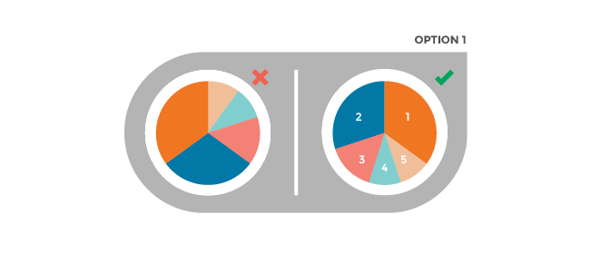
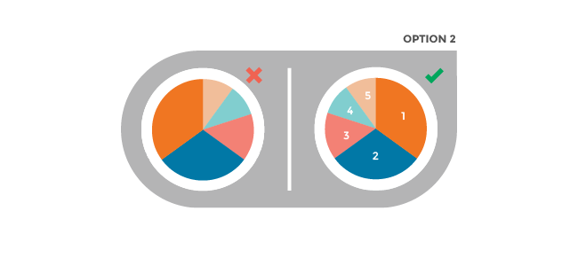
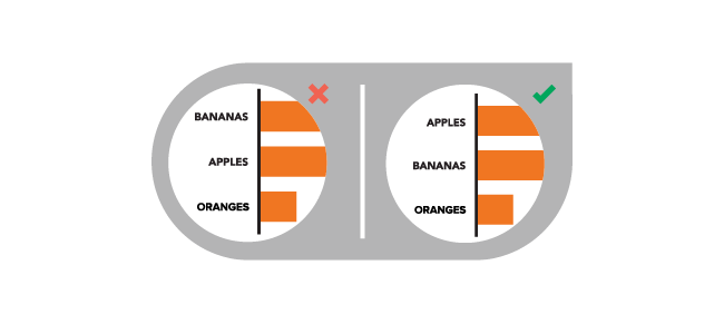
1. Disorder in the segments of the pie chart
Pie charts are among the simplest visualizations, but they are often overloaded with information. The location of the sectors should be intuitive (and their number should not exceed five). It is recommended to use one of the following two pie chart patterns, each of which will draw the reader’s attention to the most important information.
Option 1: Position the largest sector from the 12 o’clock position and further in the clockwise direction. The second largest is from 12 o’clock in the counterclockwise direction. The remaining sectors can be located below, in a counterclockwise direction.
Option 2: Position the largest sector from the 12 o’clock position and further in the clockwise direction. The remaining sectors follow it clockwise in descending order.
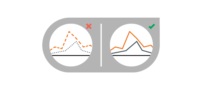
2. Using non-solid lines in a line chart
Dots and dashes are confusing. Instead, use solid lines in colors that are easy to distinguish from each other.
3. Not natural data layout
Information should be presented logically, in an intuitive sequence. Arrange categories alphabetically, by size (ascending or descending), or in another understandable order.
4. Data piling up
Make sure that no data is lost or hidden behind the design effects. For example, you can use transparency in an area plot to make sure the viewer sees all the data series.

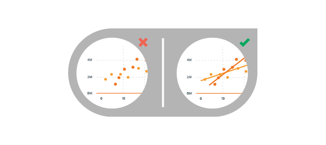
5. Extra work for the reader
Keep the data as simple as possible by helping the reader with graphic elements. For example, add a trendline to a scatter chart to show trends.
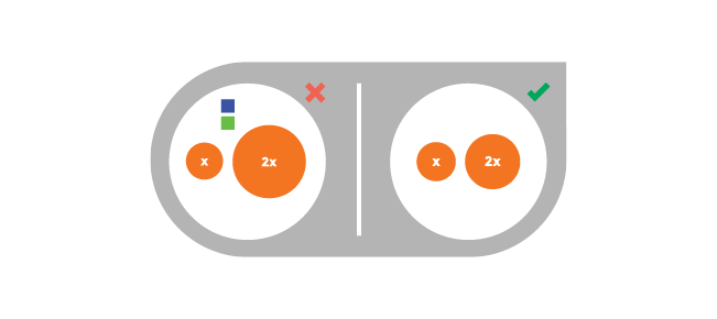
6. Data corruption
Make sure all data representations are accurate. For example, the elements of a bubble chart should be related by area, not by diameter.
7. Using different colors on the temperature map
Some colors stand out more than others, adding weight to the data. Instead, use different tones of the same color to show intensity, or use a spectrum range between two similar colors.

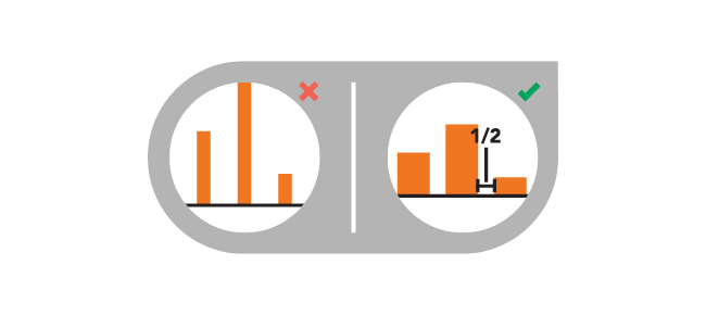
8. Columns that are too thin or too thick
You want to let your creativity run wild when creating a presentation, but remember that it will be easier for the viewer to perceive a harmonious diagram. The spacing between columns of the histogram should be equal to half the width of the column.
9. Data difficult to compare
Comparison is a convenient way to show differences, but it won’t work if the viewer can’t easily do it. The data should be presented in such a way that the reader can easily compare them.

10. Using 3D charts
They look great, but 3D shapes can distort perception, and therefore distort the data. Work with 2D shapes to present information correctly.