


Contents
This article describes the use of the Pareto principle in practice. Detailed instructions are given on how to make a Pareto chart in Microsoft Excel.
What is the Pareto principle for?
The Pareto principle was named after the famous Italian scientist and economist, Vilfredo Pareto (1848-1923). The principle is based on the rule: 20% of efforts give 80% of results, and vice versa – 80% of effort gives only 20% of results.
This principle can provide valuable and important information in a situation where there are many problems, and you need to choose which one to solve first. Or when you need to determine which product / service brings the most profit. Also, the principle can be useful in complex and ambiguous situations. Most often it is used in business – to rationalize and calculate the use of resources.
For example, let’s say you’ve been assigned to lead a team that’s having trouble working on a new project. In the course of a survey of employees about the main difficulties and obstacles in the performance of work and the study of reporting documentation, a list of problems is compiled. After the list is analyzed, it becomes possible to compile a list and rank the most common difficulties in work. In the process of studying, it becomes clear that the lack of mutual understanding between employees and shareholders of the project is the cause of most of the problems from the list, and the second largest problem is the lack of technical equipment (computers, servers, etc.). Other issues are much less important. Thus, it becomes clear that by establishing communication between employees and shareholders of the project, it will be possible to eliminate most of the contradictions and problems, and by resolving the issue with equipment, to get rid of about 90% of obstacles for the successful implementation of the project. Drawing up a Pareto chart will help you see possible ways to solve difficulties.
Using the Pareto Chart in Microsoft Excel
Independent mathematical calculation requires a lot of time. There is a special Pareto chart in Microsoft Excel. Its use saves time when calculating data. It consists of a histogram showing numerical indicators and a line graph showing the cumulative gain of each indicator. With the help of this diagram, it is possible to simplify the calculation of income data, to determine promising areas of development.
For example, consider a company that spends a significant percentage of its funds on the needs of its employees. The purpose of the diagram will be to find out how to most quickly and efficiently cut costs by 80% using the Pareto principle. It is required to determine what needs the most funds in order to effectively reduce the cost of employees in the future.
Building a table for the Pareto chart
In the beginning, you should enter the available numerical indicators in the table for the chart. In our example, there are 6 categories:
- training fees,
- hardware (computer hardware),
- office supplies (stationery),
- software (software),
- mileage (travel costs),
- other (other).
We accurately enter the available numbers in columns A – category (category) and B – amount (amount). To arrange the data in descending order, select column B with numbers, press the right mouse button, use the data command to sort them in descending order of cost sort by (sort by), largest to smallest (descending sort).
Next, you should use the function =SUM() to get the total cost. You need to add cells B3:B8 to get the sum of all expenses. It is possible to choose cell B9 and press ALT + “=”, which will do the same as the SUM command. We get the total.
Enter data and calculate the amount of costs
Important! Enter numerical data without errors, otherwise it will not work to build a graph that correctly reflects the situation.
Next, you need to create a cumulative amount column. You must enter the first amount in cell C3 – 3750 or B3. Each subsequent number must be added to the previous value in column C. Therefore, in cell C4 we enter = C3 + B4, then press “Enter”. To automatically fill in the remaining data, double-click on the autofill handle (autofill marker), or, having selected it with the left mouse button, drag it down.
Next, we create a cumulative% column (cumulative percentage). For a given column, it can be used. To do this, two previously created columns are used: B – sum, C – cumulative sum. In cell D3, enter = C3 / $B$9, then press “Enter”. The $ sign creates an absolute reference, so the total in cell B9 won’t change when you drag the formula down.
Further, as in the previous example, use the autofill marker by activating it by double-clicking the left mouse button or by dragging the autofill marker down column D. Now we have a table ready to build a Pareto chart.
Building a Pareto Chart in Microsoft Excel
To build a Pareto chart in Excel, follow the diagram below:
1. Select cells from B2 to D8. The keyboard shortcut “Alt” and F1 automatically creates a chart from the selected data.
2. Right click on the chart and select Select Data.
3. Select data source (data source).
4. Select the accumulated amount and confirm the deletion.
5. On the chart itself, select the total%, right-click on it and change Change chart series type.
6. Select line graph (line graph).
The result is a histogram with a flat line plot along the x-axis. Adding a vertical axis to get the curve for the cumulative % is required. We act as follows:
7. Right-click on the line with the total% and select Format data series (data series format).
8. Select Secondary Axis in the Series options section.
9. Next, click Close.
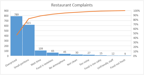
Thus we create a complete Pareto chart. In this chart, the blue bars represent the costs for the needs of workers from largest to smallest (which was sorted at the stage of compiling the table). The green line represents the accrued percentage of spending – you can see that the threshold line of 80% stops at stationery.
We draw conclusions from the constructed diagram. Paying for tuition, computer equipment and office supplies takes up most of our expenses. So with the help of such diagrams it is possible not only to determine the main items of expenditure, but also to build a diagram showing the main items of income, the most effective methods in work.
Features of data selection for the Pareto chart
Before creating a table for a Pareto chart, you should pay attention to the following important factors:
- Select the category by which the available numerical indicators will be grouped. Not always the most understandable option would be to use financial indicators.
- Decide with measurement value: amount of work, time, frequency, amount of money spent.
- Determine the time period for which the chart will be built. Data for different years, months and even weeks can be drastically different. Also, if you make charts for several time periods, it becomes possible to make a comparative analysis of indicators, which will provide additional information.
With an understanding of the Pareto principle and the ability to correctly build charts, it is possible, if necessary, to carry out a deep analysis of a wide variety of indicators.