


Contents
Let’s assume that we are faced with the classic task of transport logistics: to visualize the movement of an object along a given route from several intermediate points. For specifics, let’s take the Zhiguli fast branded train moving along the Moscow-Samara route according to the following schedule (taken from Yandex.Schedules):

To solve the problem, we need Excel 2013-2016 with the Power Map add-in installed. In Excel 2016 it is installed by default, for Excel 2013 you can download its free preview version.
Stage 1. Find the coordinates
For unambiguous binding to intermediate points of the route, it is better to use not the names of settlements (they may be repeated or absent in principle in the right place), but normal geographical coordinates. Just click on the desired place in Yandex Maps or Google Maps and you will see the latitude and longitude of this point:

Let’s add the found coordinates to our original train schedule table:

Stage 2. We crush the hauls
To smoothly display the movement of the train on the map, we need to divide each stage into several sections (the more there are, the smoother the animation will be). Thus, we are faced with the task of obtaining approximate coordinates and time for each intermediate point. You can solve the problem with a formula or a macro.
For example, if we want to break each stage into six intervals (i.e. five points), then we can implement everything with one formula:

But you will have to insert intermediate lines, enter and copy the formula to all green cells for each stage manually.
Another option is a macro, which is much more convenient with a large number of hauls and intermediate route points. Open editor Visual Basic tab developer (Developer) or press keyboard shortcut Alt+F11. Insert a new empty module into your book via the menu Insert – Module and copy this code there:
Sub MakeRouteTable() Dim DeltaT#, DeltaS#, DeltaD#, NumSteps%, FirstRow%, LastRow% Const MINS_IN_ONE_STEP = 1 Application.ScreenUpdating = False FirstRow = ActiveCell.CurrentRegion.Rows(3).Row LastRow = ActiveCell.CurrentRegion.Rows .Count + FirstRow - 3 For i = 6 To 3 Step -1 'determine the number of steps per stage NumSteps = Int((Cells(i, 2) - Cells(i - 1, 2)) * 24 * 60 / MINS_IN_ONE_STEP) ' calculate the change in coordinates and time at each step DeltaT = (Cells(i, 2) - Cells(i - 1, 2)) / (NumSteps + 1) DeltaS = (Cells(i, 3) - Cells(i - 1, 3 )) / (NumSteps + 1) DeltaD = (Cells(i, 4) - Cells(i - 1, 4)) / (NumSteps + 1) 'Fill interval rows for each run For j = 1 To NumSteps Rows(i) .Insert Cells(i, 2) = Cells(i + 1, 2) - DeltaT Cells(i, 3) = Cells(i + 1, 3) - DeltaS Cells(i, 4) = Cells(i + 1, 4 ) - DeltaD Next j Next i
As you can easily figure out, the MINS_IN_ONE_STEP constant sets the number of minutes in each step – you can change its value as you wish. Now if you select a table with data or set an active cell in it, and then run our macro with a keyboard shortcut Alt+F8 or by button Macros tab developer (Developer — Macros), then our table will be transformed into the following form:

As you can see, each stage is now divided into several intervals – 1 minute each.
Stage 3. Go to the map
Left just a little bit. Select the resulting table and on the tab Insert click 3D map (Insert — 3D-map):

Don’t confuse it with a button Maps (the one with the globe) or Bing Maps (yellow color). Once clicked, the Power Map add-in window should open.
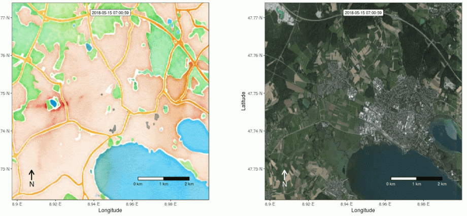
In the right part of the window, in the panel, add in the group Placement Locations (Location) latitude and longitude fields and select the name of the corresponding column from our table next to each. If you do everything correctly, then our route should immediately be displayed on the map:

Now it remains to select from the drop-down list Time (Time) column with date-time values from our table and you can start the animation using the play button at the bottom of the window:
Additionally, you can play around with the layer settings – button Layer Options (Layer Options) in the lower right corner – and set the color, size, transparency, etc. displayed points.
If you click on the inconspicuous clock icon next to the drop-down list Time, then you can change the display mode and draw not the route, but the train itself.
When you left-click on any route point of interest, we will see its detailed data – coordinates and travel time:

Stage 4. Several trains at once
It is no secret that in fact two trains run along the Moscow-Samara route – in antiphase: when one starts from Moscow, the other starts moving towards it from Samara at about the same time. In the morning, one of them comes to Samara, and the other, respectively, to Moscow, and in the evening the process starts again. The schedule of the second roughly mirrors the first:

What can I do to display them both on the map at once?
If more than one object moves along the route at the same time, then the data on them can be processed in a similar way (Steps 1 and 2) and simply added to the continuation of our route table. And to distinguish trains from each other, add another column with the name of the object:

Now, if we build another visualization using such a table, we will see the movement of two trains at the same time:
Beauty 🙂
- All ways to visualize geodata on maps in Excel
- Animated bubble chart