At a training on visualization recently, one of the students voiced an interesting task: it is necessary to visually show the changes in costs and profits for certain products over the past two years. Of course, you can not strain and go the usual way, drawing banal graphs, columns or even, God forgive me, “cakes”. But if you push yourself a little, then a good solution in such a situation may be to use a special type scatter plot with arrows (“before-before”):
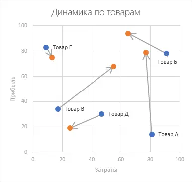
Of course, this is not only suitable for goods and cost-benefit. On the go, you can come up with many scenarios where this type of chart will be “in the subject”, for example:
- Change in income (X) and life expectancy (Y) for different countries over the past two years.
- Change in the number of customers (X) and the average check (Y) of restaurant orders
- The ratio of the value of the company (X) and the number of employees in it (Y)
- …
If something similar occurs in your practice, then it makes sense to figure out how to build such beauty.
I have already written about bubble charts (even animated ones). Scatter chart (XY Scatter Chart) – this is a special case of bubble (Bubble Chart), but without the third parameter – the size of the bubbles. Those. each point on the graph is described by only two parameters: X and Y. Thus, the construction begins with the preparation of the initial data in the form of two tables:
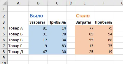
Let’s build what “was” first. To do this, select the range A3:C8 and select on the tab Insert (Insert) Command Recommended charts (Recommended Charts), and then go to the tab All diagrams (All charts) and choose the type Point (XY Scatter Chart):
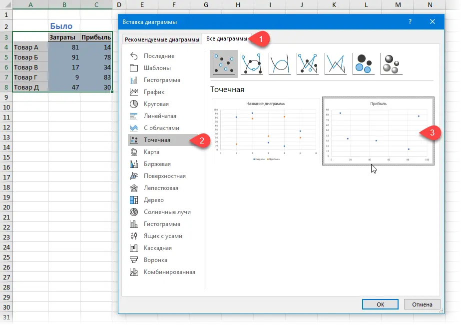
After clicking on OK we get the blank of our diagram.
Now let’s add data to it from the second table “Became”. The easiest way to do this is by copying. To do this, select the range E3:F8, copy it and, having selected the chart, perform a special paste into it using Home — Paste — Special Paste (Home — Paste — Paste Special):

In the window that appears, select the appropriate insert options:
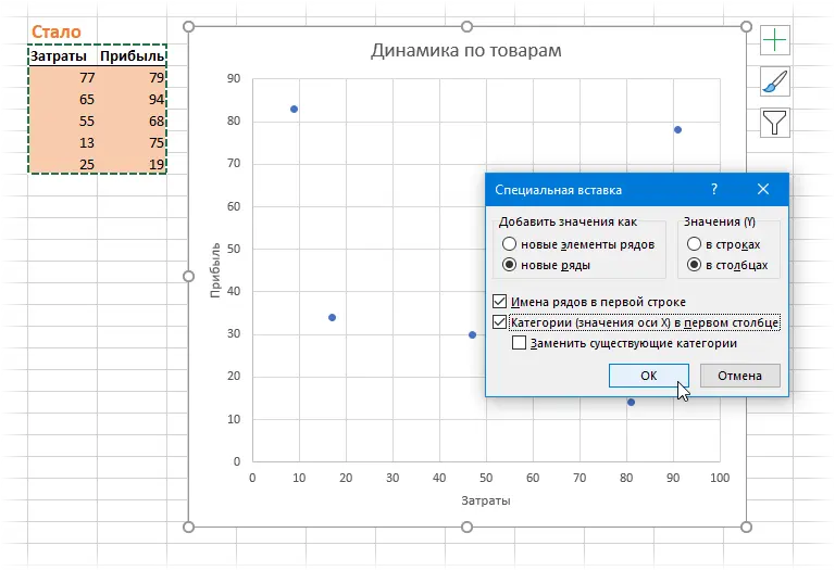
After clicking on OK, the second set of points (“become”) will appear on our diagram:
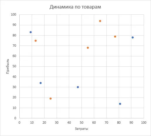
Now the fun part. To simulate arrows, it will be necessary to prepare a third table of the following form from the data of the first and second tables:
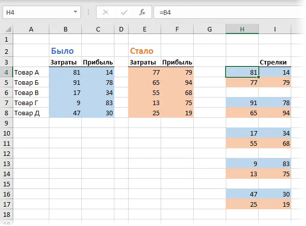
Notice how it’s set up:
- rows from the source tables alternate in pairs, fixing the beginning and end of each arrow
- each pair is separated from the others by a blank line so that the output is separate arrows, and not one big one
- if the data may change in the future, then it makes sense to use not numbers, but links to the original tables, i.e. in cell H4 enter the formula =B4, in cell H5 enter the formula =E4, and so on.
Let’s select the created table, copy it to the clipboard and add it to our diagram using Paste Special, as we did earlier:
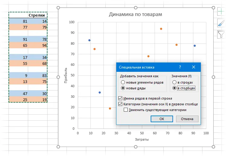
After clicking on OK, new start and end points for each arrow will appear on the diagram (I have them in gray), covering the already built blue and orange ones. Right click on them and select command Change the chart type for a series (Change Series Chart Type). In the window that opens, for the original rows “before” and “before”, leave the type Point, and for a series of “arrows” we set Point with straight lines:
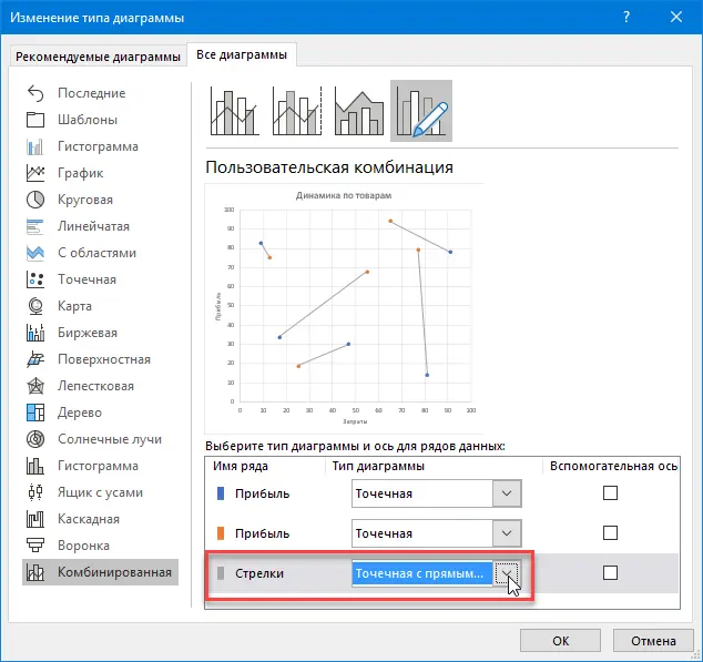
After clicking on OK, our points “was” and “became” will be connected by straight lines. All that remains is to right-click on them and select the command Data series format (Format Data Series), and then set the line parameters: thickness, arrow type and their sizes:
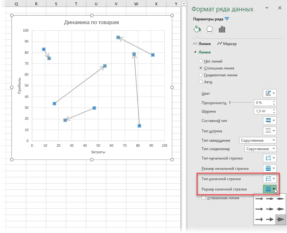
For clarity, it would be nice to add the names of the goods. For this:
- Click on any point and select from the context menu Add data labels (Add Data Labels) – numeric point labels will be added
- Right click on labels and select command Signature Format (Format Labels)
- In the panel that opens, check the box Values from cells (Values from cells), press the button Select Range and highlight the product names (A4:A8).
That’s all – use it 🙂
- What is a bubble chart, how to read and plot it in Excel
- How to make an animated bubble chart
- Several ways to build Plan-Fact charts in Excel


