How do you like the idea of adding such visual projection lines from the points of the graph on the X and Y axes to some of your charts?

Looks nice, right? Implementing this is very easy.
Let’s build a chart first. Select the range with the source data (in our example, table A1:B8) and on the tab Insert choose Dotted (Scatter) with connecting segments between points:

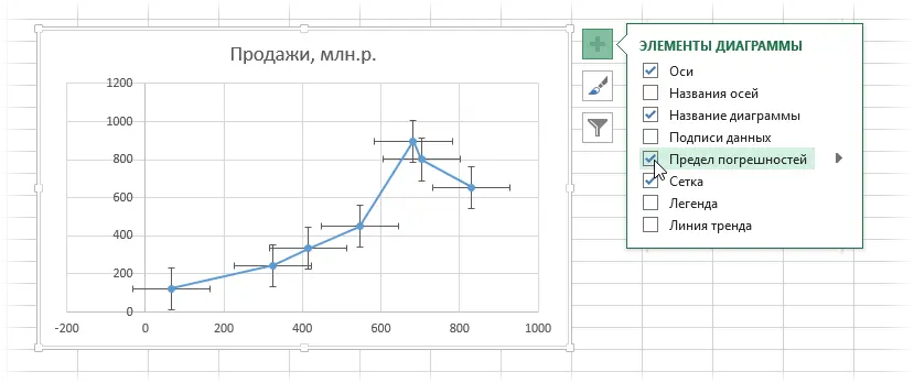
Now let’s add error bars to the points of our diagram. In Excel 2013, this can be done using the plus sign button to the right of the chart by enabling the checkbox Error Bars:

In Excel 2007-2010, this can be done by selecting on the tab Layout button Error Bars.
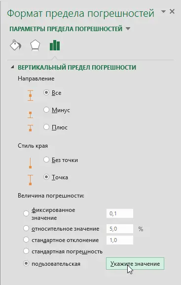
Typically, these cross-shaped “whiskers” are used to visually display on the chart the accuracy and measurement errors, tolerances, oscillation corridors, etc. We use them to lower the projection lines from each point on the axis. To do this, first select the vertical “whiskers” and press the keyboard shortcut Ctrl + 1 or right click on them and select command Format Vertical Error Bars. In the window that opens, you can change their display settings and sizes.

Choose an option Custom (Custom) and press the button Set Values. In the window that opens, we set a positive error value (upper “whisker”) = 0, and as negative values (lower “whiskers”) we select the initial data along the Y axis, i.e. range B2:B8:

After clicking on OK the upper “whiskers” should disappear, and the lower ones should stretch exactly to the X axis, depicting projection lines:

It remains to repeat this procedure for horizontal errors in exactly the same way, specifying the positive value of the error =0, and the negative value as the range A2:A8:

The appearance of lines can be adjusted by right-clicking on them with the command Format of vertical (horizontal) bars of errors (Format Error Bars) and choosing a color for them, a dotted line instead of a solid line, etc.
If you have dates on the X axis, then after adjusting the size of the horizontal error limits, the scale will most likely “move” along the X axis and you will need to adjust its minimum limit by right-clicking on the axis and selecting the command Format Axis or by pressing the keyboard shortcut Ctrl + 1:

- How to build an interactive “live” diagram
- How to automatically color a chart in the color of cells with source data
- How to build a waterfall chart


