


Contents
- How to build a pie chart in Excel
- How to Create Different Types of Pie Charts in Excel
- Customize and improve pie charts in Excel
- Tips for Creating Pie Charts in Excel
In this tutorial on pie charts, you will learn how to create a pie chart in Excel, how to add or remove a legend, how to label a pie chart, show percentages, how to split or rotate it, and much more.
Pie charts, also known as sector numbers, are used to show how much of a whole individual amounts or percentages make up. In such graphs, the whole circle is 100%, while individual sectors are parts of the whole.
The public likes pie charts, while data visualization experts hate them, and the main reason for this is that the human eye is not able to accurately compare angles (sectors).
If you can’t completely abandon pie charts, then why not learn how to build them correctly? Freehand drawing a pie chart is difficult, given the confusing percentages that present a particular problem. However, in Microsoft Excel, you can build a pie chart in just a couple of minutes. Then all you have to do is spend a few more minutes on the diagram and use the special settings to give it a more professional look.
How to build a pie chart in Excel
Building a pie chart in Excel is very easy, it only takes a few clicks. The main thing is to correctly format the source data and choose the most appropriate type of pie chart.
1. Prepare the initial data for the pie chart
Unlike other Excel charts, pie charts require the source data to be organized in one column or one row. After all, only one data series can be built in the form of a pie chart.
In addition, you can use a column or row with category names. The category names will appear in the pie chart legend and/or data labels. In general, a pie chart in Excel looks best if:
- The chart has only one data series.
- All values are greater than zero.
- There are no empty rows and columns.
- The number of categories does not exceed 7-9, since too many sectors of the diagram will blur it and it will be very difficult to perceive the diagram.
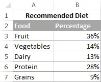
As an example for this tutorial, let’s try to build a pie chart in Excel based on the following data:
2. Insert a pie chart on the current worksheet
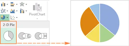
Select the prepared data, open the tab Insert (Insert) and select the appropriate chart type (the various types of pie charts will be discussed a little later). In this example, we will create the most common 2-D pie chart:
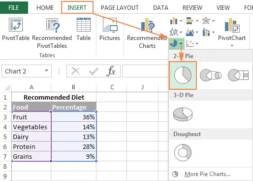
Tip: When highlighting source data, be sure to select column or row headings so that they automatically appear in your pie chart titles.
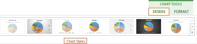
3. Choose the style of the pie chart (if necessary)
When the new pie chart appears on the worksheet, you can open the tab Constructor (Design) and in the section Chart styles (Charts Styles) Try different styles of pie charts, choosing the one that best suits your data.
The default pie chart (Style 1) in Excel 2013 looks like this on the worksheet:
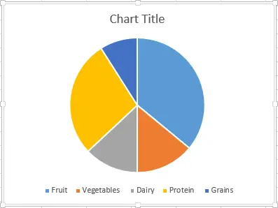
Agree, this pie chart looks a bit rustic and certainly needs some improvements, such as the title of the chart, data labels, and perhaps more attractive colors should be added. We will talk about all this a little later, but now we will get acquainted with the types of pie charts available in Excel.
How to Create Different Types of Pie Charts in Excel
When creating a pie chart in Excel, you can choose from the following subtypes:
Pie chart in Excel
This is the standard and most popular pie chart subtype in Excel. To create it, click on the icon Circular (2-D Pie) tab Insert (Insert) in section Diagrams (Charts).
Volumetric pie chart in Excel
Volumetric circular (3-D Pie) charts are very similar to 2-D charts but display data on 3-D axes.
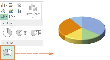
When building a 3-D pie chart in Excel, additional features appear, such as XNUMX-D rotation and panorama.
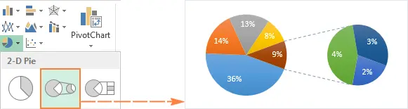
Secondary Pie or Secondary Bar Chart
If the pie chart in Excel consists of a large number of small sectors, then you can create Secondary circular (Pie of Pie) chart and show these minor sectors on another pie chart, which will represent one of the sectors of the main pie chart.
secondary ruled (Bar of Pie) is very similar to Secondary circular (Pie of Pie) chart, except that the sectors are displayed on the secondary histogram.
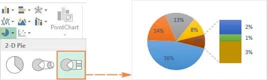
While creating secondary circular (Pie of Pie) or secondary ruled (Bar of Pie) charts in Excel, the last three categories will be moved to the second chart by default, even if these categories are larger than the others. Since the default settings are not always the best, you can do one of two things:
- Sort the original data on the worksheet in descending order so that the smallest values end up in the secondary chart.
- Choose yourself which categories should appear on the secondary chart.
Selecting Data Categories for the Secondary Chart
To manually select data categories for a secondary chart, do the following:
- Right-click on any sector of the pie chart and select from the context menu Data series format (Format Data Series).
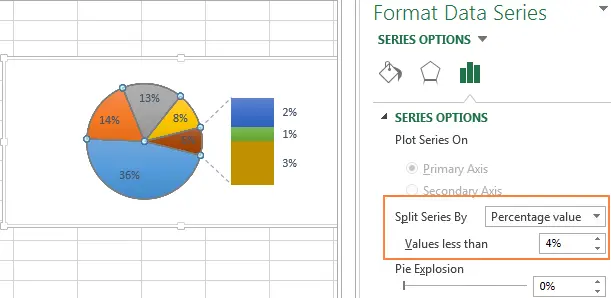
- On the panel that appears, under Row Options (Series Options) in the dropdown list Split row (Split Series By) select one of the following options:
- Position (Position) – allows you to select the number of categories that will appear in the secondary chart.
- Value (Value) – allows you to define the threshold (minimum value). All categories below the threshold will be moved to the secondary chart.
- Percent (Percentage value) – same as Value (Value), but the percentage threshold is specified here.
- Other (Custom) – allows you to select any sector from the pie chart on the worksheet and specify whether to move it to the secondary chart or leave it in the main one.
In most cases, a threshold expressed as a percentage is the most reasonable choice, although it all depends on the initial data and personal preferences. This screenshot shows how to split a series of data using a percentage:
Additionally, you can configure the following settings:
- Change Side clearance (Gap between two charts). The gap width is set as a percentage of the secondary chart width. To change this width, drag the slider, or manually enter the desired percentage.
- Resize the secondary chart. This indicator can be changed using the parameter Size of the second construction area (Second Plot Size), which represents the size of the secondary plot as a percentage of the size of the main plot. Drag the slider to make the chart bigger or smaller, or manually enter the percentage you want.
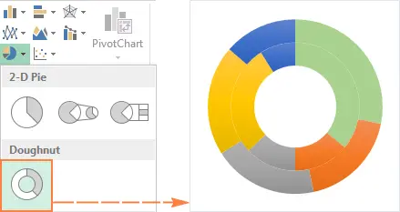
Donut charts
Annular (Doughnut) chart is used instead of a pie chart when more than one data series is involved. However, in a donut chart it is quite difficult to estimate the proportions between the elements of different series, so it is recommended to use other types of charts (for example, a bar chart).
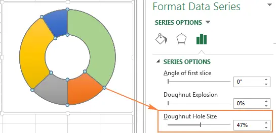
Resize a hole in a donut chart
When creating a donut chart in Excel, the first thing to do is resize the hole. This is easy to do in the following ways:
- Right-click anywhere on the donut chart and from the context menu select Data series format (Format Data Series).
- In the panel that appears, go to the tab Row Options (Series Options) and change the size of the hole by moving the slider, or enter the percentage manually.

Customize and improve pie charts in Excel
If an Excel pie chart is just for getting a quick look at the big picture of your data, then the standard default pie chart is fine. But if you need a beautiful diagram for a presentation or for some similar purpose, then you can improve it a bit by adding a couple of strokes.
How to add data labels to a pie chart in Excel
A pie chart in Excel is much easier to understand if it has data labels on it. Without signatures, it is difficult to determine what share each sector occupies. You can add labels to a pie chart for the entire series or just for a single element.
Add data labels to pie charts in Excel
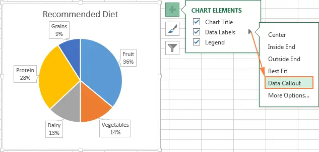
Using this pie chart as an example, we’ll show you how to add data labels for individual sectors. To do this, click on the icon Chart elements (Chart Elements) in the upper right corner of the pie chart and select the option Data Signatures (Data Labels). Here you can also change the location of the labels by clicking on the arrow to the right of the parameter. Compared to other types of charts, pie charts in Excel provide the most choice of label placement:
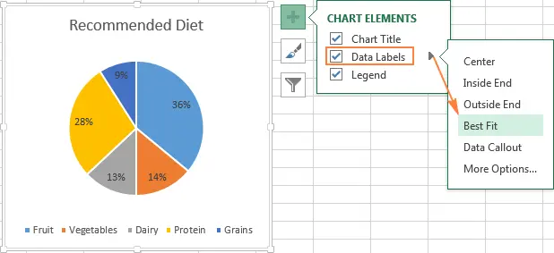
If you want the labels to be shown inside callouts outside the circle, select Callout Data (Data Callout):
Tip: If you decide to place the labels inside the chart sectors, please note that the default black text is difficult to read against the background of the dark sector, as, for example, is the case with the dark blue sector in the picture above. To make it easier to read, you can change the label color to white. To do this, click on the signature, then on the tab Framework (Format) click Filling the text (Text Fill). In addition, you can change the color of individual sectors of the pie chart.
Categories in data labels
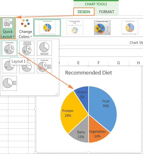
If an Excel pie chart has more than three pie slices, then labels can be added directly to each pie slice so that users don’t have to jump back and forth between the legend and the chart looking for information about each pie.
The fastest way to do this is to select one of the pre-made layouts in the tab Constructor > Chart layouts > Express layouts (Design > Chart Styles > Quick Layout). Layout 1 и Layout 4 contain category names in data labels:
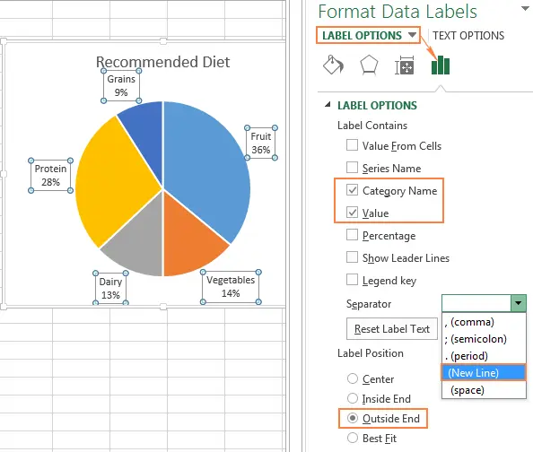
Click the icon to access other options. Chart elements (Chart Elements) in the upper right corner of the pie chart, click on the arrow next to Data Signatures (Data Labels) and select More options (More options). A panel will appear Data Label Format (Format Data Labels) on the right side of the worksheet. Go to section Signature Options (Label Options) and tick the option Category name (Category Name).
In addition, you can take advantage of the following options:
- Under the heading Include in Signature (Label Contains) select the data to be contained in the labels. In our example, this Category name (Category Name) и Value (Value).
- In the dropdown list Separator (Separator) choose how to separate the data in the labels. In our example, the separator is selected New line (New Line).
- Under the heading Label position (Label Position) choose where to place the label. In our example, we have chosen At the edge outside (Outside End).
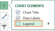
Tip: Now the data labels are added to the pie chart, the legend is no longer needed and can be removed by clicking on the icon Chart elements (Chart Elements) and unchecking the box next to Legend (Legend).
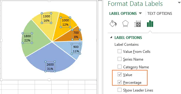
How to show percentages on a pie chart in Excel
When the source data in a pie chart is expressed as a percentage, the signs % will appear on the chart automatically as soon as the option is enabled Data Signatures (Data Labels) in the menu Chart elements (Chart elements) or parameter Value (Value) on panels Data Label Format (Format Data Labels) as shown in the example above.
If the original data is expressed in numbers, then you can show in the signatures either the original values, or percentages, or both.
- Right-click on any sector of the pie chart and select from the context menu Data Label Format (Format Data Labels).
- In the panel that appears, check the boxes Value (Value) and/or Share (Percentage) as shown in the example. Excel will calculate the percentages automatically based on the fact that the entire pie chart represents 100%.
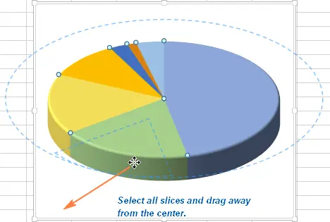
Splitting a pie chart or highlighting individual sectors
To emphasize individual values of a pie chart, you can break it, i.e. separate all sectors from the center of the diagram. You can also highlight specific sectors by moving only them away from the main chart.
Fragmented pie charts in Excel can be in 2-D or 3-D format, donut charts can also be split.

How to split a pie chart in Excel
The quickest way to break a pie chart in Excel is to click on it to select all the slices and then drag them away from the center of the chart with your mouse.
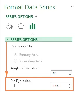
In order to fine-tune the breakdown of a pie chart, you must perform the following steps:
- Right-click on any sector of the pie chart in Excel and select from the context menu Data series format (Format Data Series).
- In the panel that appears, select a section Row Options (Series Options), then drag the slider Sliced Pie Chart (Pie Explosion) to increase or decrease the distance between sectors. Or enter the required percentage value in the field on the right.
How to highlight individual sectors of a pie chart
To draw the user’s attention to a particular sector of the pie chart, you can push this sector out of the general circle of the chart.
I repeat: The fastest way to push individual chart sectors is to select them and move them away from the center with the mouse. To select a separate sector, you need to double-click on it.
There is another way: select the sector you want to push, right-click on it and in the context menu click Data series format (Format Data Series). Then, in the panel that appears, open the section Row Options (Series Options) and adjust the parameter Point cutting (Point Explosion):
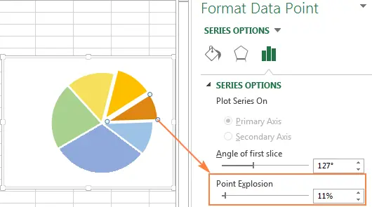
Note: If you need to select multiple sectors, then you will need to repeat this process with each of them, as shown above. It is not possible to select multiple sectors of a pie chart at once in Excel, but you can split the entire pie chart, or select only one sector at a time.
How to expand a pie chart in Excel
When creating a pie chart in Excel, the order in which the categories are built depends on the order in which the data is placed on the worksheet. You can rotate the pie chart 360 degrees to show data from different perspectives. As a general rule, a pie chart looks better if its smallest slices are in front.
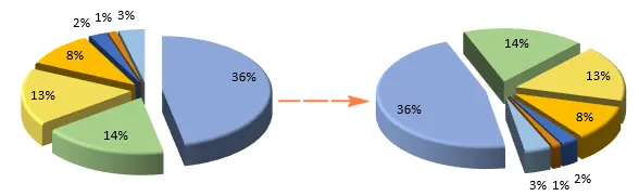
To rotate a pie chart in Excel, you need to follow these steps:
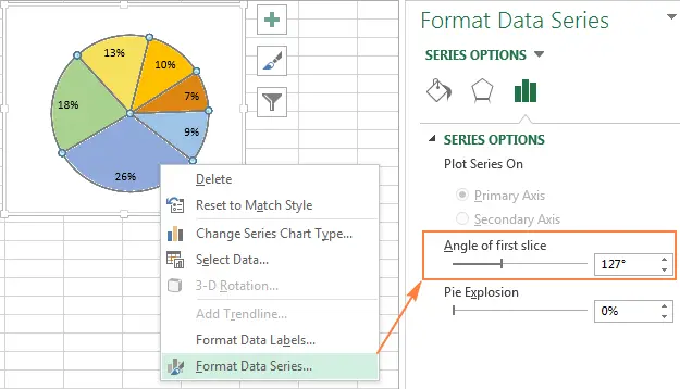
- Right click on the chart and select Data series format (Format Data Series).
- On the panel that appears, under Row Options (Series Options) move the parameter slider Rotation angle of the first sector (Angle of first slice) to expand the chart, or enter the desired value manually.
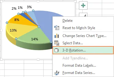
Rotating XNUMXD Pie Charts
An option is available for XNUMXD pie charts XNUMXD Rotation (3D Rotation). To access this option, you need to right-click on any sector of the diagram and select from the context menu XNUMXD Rotation (3-D Rotation).
A panel will appear Chart Area Format (Format Chart Area), where you can set the following parameters for the rotation of a three-dimensional figure:
- Horizontal Rotation around the X axis (X Rotation)
- The vertical Rotation around the Y axis (Y Rotation)
- Viewing angle – parameter Perspective (Perspective)
Note: Pie charts in Excel can rotate around the horizontal axis and vertical axis, but not around the depth (Z-axis). Therefore, the parameter Rotation around the Z axis (Z Rotation) is not available.
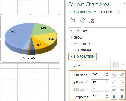
If you click on the up or down arrows in the fields for entering the angles of rotation, the diagram will immediately rotate. Thus, it is possible to make small changes in the angle of rotation of the diagram until it is in the desired position.
For more options for rotating charts in Excel, see the article “How to rotate charts in Excel?”
How to arrange pie slices by size
As a rule, pie charts are more understandable if their sectors are sorted from largest to smallest. The fastest way to achieve this result is to sort the original data on the worksheet. If it is not possible to sort the source data, then you can change the arrangement of sectors in the Excel pie chart as follows:
- Create a pivot table from a source table. Step-by-step instructions are given in the tutorial on creating pivot tables in Excel for beginners.
- Put category names in field Line (Row) and numeric data in the field The values (values). The resulting pivot table should look something like this:
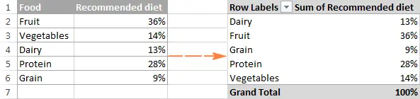
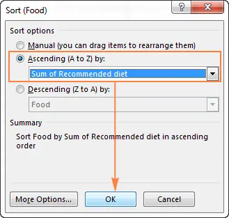
- Click on the autofilter button next to the title Row names (Row Labels), then click Additional sort options (More Sort Options).
- In the dialog box Sorting (Sort) choose to sort the data in ascending or descending order:
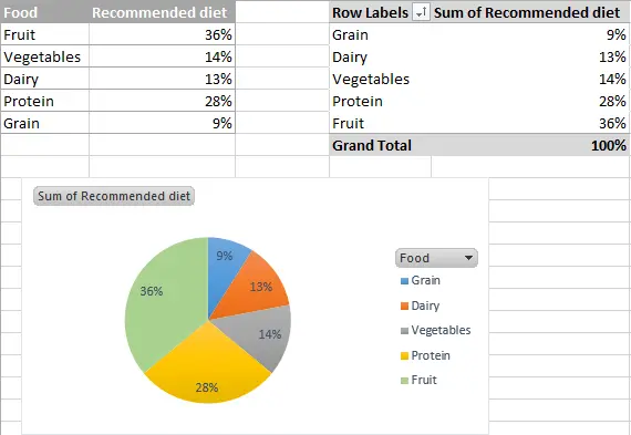
- Build a pie chart from the created pivot table and update it at any time.
How to change colors in a pie chart
If the standard colors of a pie chart in Excel do not suit you, there are several ways out:
Change the color scheme of a pie chart in Excel
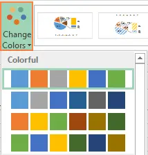
To select a different color scheme for the pie chart in Excel, you must click on the icon Chart styles (Chart Styles), open tab Color (Color) and select the appropriate color scheme. The icon appears when a chart is selected to the right of it.
You can also click anywhere on the pie chart to bring up a group of tabs on the Menu Ribbon Working with charts (Chart Tools) and on the tab Constructor (Design) in the section Chart styles (Chart Styles) click the button Change colors (Change Colors):
Choose colors for each sector separately
As you can see in the picture above, the choice of chart color schemes in Excel is not rich, and if you need to create a stylish and bright pie chart, you can choose your own color for each sector. For example, if the data labels are located inside the chart sectors, then you need to take into account that black text is difficult to read against dark colors.
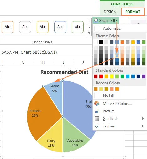
To change the color of an individual sector, select it by double-clicking on it with the mouse. Then open the tab Framework (Format), press Shape fill (Shape Fill) and select the desired color.
Tip: If the Excel pie chart has a large number of small, not very important sectors, then you can color them in gray.
Как настроить оформление круговой диаграммы в Excel
If you are creating a pie chart in Excel for a presentation or for exporting to other applications, you can give it a more attractive look.
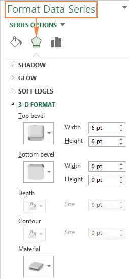
To open the formatting options, right-click on any sector of the pie chart and in the context menu click Data series format (Format Data Series). A panel will appear on the right side of the worksheet. On the tab Effects (Effects) experiment with the options Тень (Shadow), backlight (Glow) and Smoothing (Soft Edges).
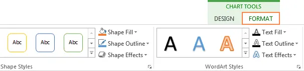
On the Advanced tab Framework (Format) other useful formatting tools are available:
- Resizing the pie chart (height and width);
- Shape fill and outline changes;
- Using various effects for the figure;
- Using WordArt styles for text elements;
- And much more.
To use these formatting tools, select the pie chart element you want to format (legend, data label, pie slice, or chart title) and click the Framework (Format). Appropriate formatting options will be active, and unnecessary formatting options will not be active.
Tips for Creating Pie Charts in Excel
Now that you know how to build a pie chart in Excel, let’s try to compile a list of the most important guidelines that will help make it both attractive and meaningful:
- Sort sectors by size. To make the pie chart more understandable, you need to sort the sectors from large to small, or vice versa.
- Group the sectors. If the pie chart consists of a large number of sectors, it is best to group them, and then use separate colors and shades for each group.
- Color minor small sectors in gray. If the pie chart contains small sectors (less than 2%), color them gray or group them into a separate category called Other.
- Rotate Pie Chartso that the smallest sectors are in front.
- Avoid too many data categories. Too many sectors on the chart looks like a pile. If there are too many categories of data (more than 7), then separate small categories into a secondary pie or secondary bar chart.
- Don’t use a legend. Add labels directly to the pie slices so that readers don’t have to look between the slices and the legend.
- Don’t get carried away with 3-D effects. Avoid a lot of 3-D effects in a diagram, as they can greatly distort the perception of information.