Contents
In this article, we will talk about how to create a chart “Sales funnel» in Excel. Such a graph can be created in 5 simple steps from several stacked bar charts.
What is a funnel chart?
Graphic “Sales funnel» is similar to a bar chart, with the data series centered to create a funnel shape. In this example, the sales funnel shows how many customers are in each sales stage at a given point in time.
Why Use a Sales Funnel Chart?
The funnel chart gives the reader a clear picture of the stages of the process. In our case, we sell pipelines (see the figure below). On the Stage 1 (Stage 1), where the first contact with a potential client (Initial Contact) takes place, we have the largest number of clients, but only a small proportion of these same clients reach Stage 5 (Stage 5) where the purchase takes place.
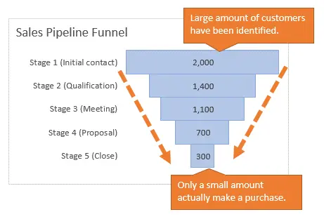
Aligning the centers of the bars in the plotting area creates a funnel shape. The data may not always fit into a funnel as straight as our example, but centered bars make the sales funnel clearer to present and understand.
Building a Sales Funnel in 5 Easy Steps
A funnel chart can be created in 5 easy steps from a stacked bar chart.

In the stacked bar chart, an intermediate series has been created, thanks to which the bands we need are aligned. The data for this intermediate series is created using a simple formula, and then it becomes the first series in the stacked bar chart. The fill of this row is changed to colorless so that the user sees only the funnel itself.
Step 1: Prepare the Data and Create a Stacked Bar Chart
The first step is to add a column filled with the formula to the left of the column with the original data. This formula creates data for an intermediate series that will align each bar based on the largest value in the data set.
Intermediate formula: This formula finds the maximum value in the specified range, subtracts the value of the current row from it, and divides the result by 2.
=(МАКС($D$7:$D$11)-D8)/2
=(MAX($D$7:$D$11)-D8)/2
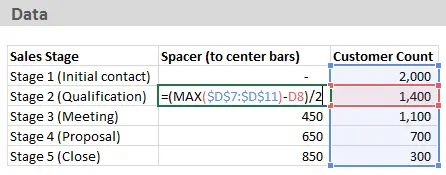
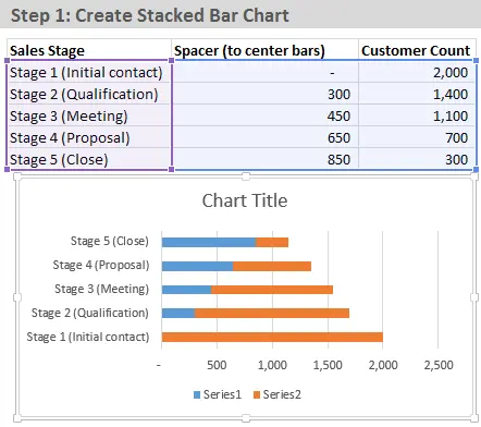
When the data is ready, select it and create stacked bar chart (Stacked Bar Chart).
Step 2: Reverse the category order
Initially, when you create a chart, the categories will be in the reverse order of how they are listed on the worksheet. To arrange data in reverse order:
- Right-click on the vertical axis (which lists category names) and select Axis Format (Format Axis).
- In section Пaxis parameters (Axis Options) check the box Reverse order of categories (Categories in reverse order).
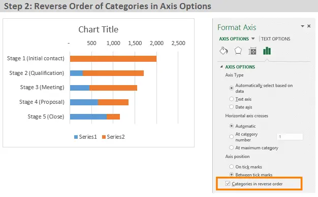
The categories are now in the same order as they are listed on the sheet.
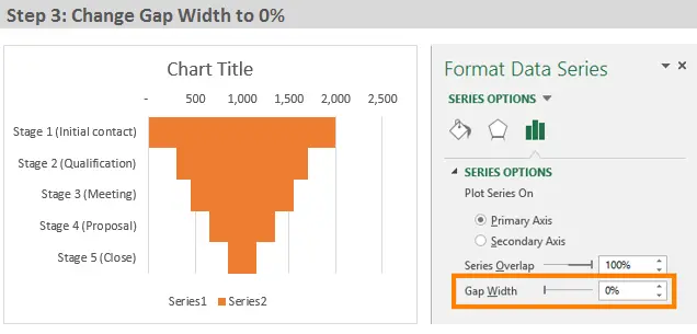
Step 3: Set Side Clearance to 0%
Next, we will change the width of the chart bars so that their borders touch. This will make the chart look more like a funnel:
- Right-click on any of the chart bars and select Data series format (Format Data Series).
- In section Row Options (Series options) set Side clearance (Gap Width) equal 0%.
Step 4: Removing the middle row fill
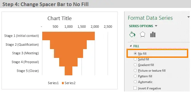
The fill color of the intermediate row should be transparent. This will make it invisible to the reader, which means that only the funnel data will remain visible:
- Right-click on any intermediate row strip and select Data series format (Format Data Series).
- In section Fill (Fill) select No fill (No fill).
Step 5: Preparing the Chart for the Presentation
Now you can customize the appearance of the chart and remove all unnecessary. Excel adds many elements (grid, legend, etc.) that are not needed in this case.
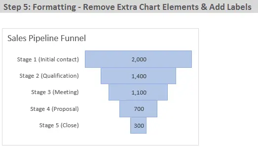
Here’s what I changed in my chart’s appearance settings:
- Removed the legend
- Removed vertical grid lines
- Removed the vertical axis line
- Removed the horizontal axis
- Changed the fill color and outline of the funnel bars
- Changed the chart title
- Added data labels and aligned them to the center.
Where else can you use a sales funnel?
The above example uses the results of customer counts at different stages of the pipeline sale. In addition, a funnel chart can be used to show:
- Number of students at each level of study (undergraduate, graduate, PhD, etc.)
- Number of employees at each level of the organization (subordinate, manager, manager, etc.)
- Amount of accounts receivable by limitation period (30, 60, 90 days)
- Age distribution of clients/population (20, 30, 40 and so on)
What other areas of application exist for the diagram “Sales funnel“? Please ask any questions and leave suggestions below in the comments. Thank you!


